The toolkit is licensed under a developer license, meaning that a license is required per developer, no additional license needed per application. The toolkit has a 7-day evaluation period.
Description
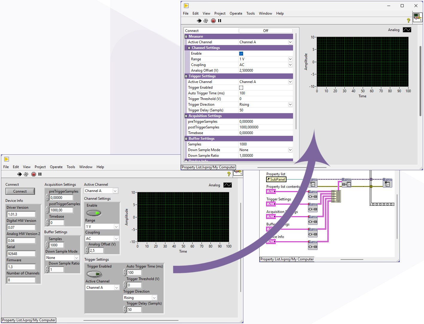
Declutter your front panel by grouping controls and indicators into a single listbox.
When a front panel contains numerous controls and indicators, it quickly becomes cluttered and large. The property list (Control listbox) offers the solution. The toolkit allows you to organize controls and indicators into a single listbox.
The controls in the listbox can then be controlled just like regular controls and indicators, with the maximum flexibility of the event-based functionality.
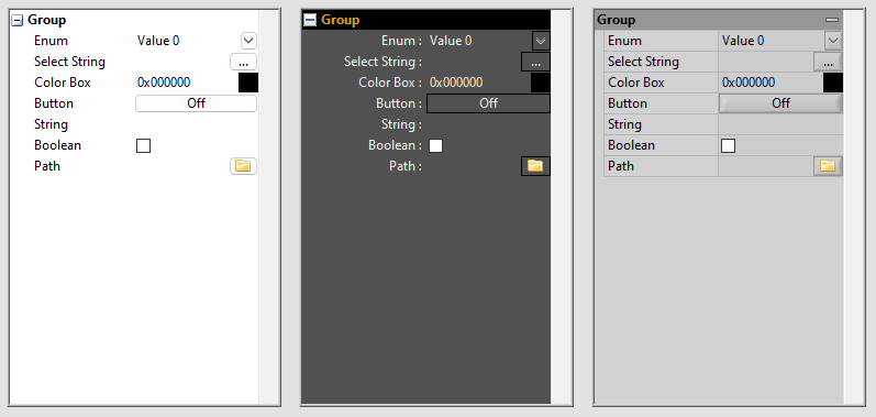
It’s also possible to group succeeding values. The groups are represented with names without any value. By clicking the group it will close or expend the lines under the group.
In a property list every line represents a single value. The value itself can be from different data types and also have their own way of representing and changing the value. At the moment the following data types are implemented:
String (used for : strings, numeric values,…)
String with selection button (used for : Path, complext settings that use there vi,…)
Boolean
Button
Enum (used for : enum, rings and combo box,…)
Colorbox
Custom style
You can customize the list box’s appearance to match your application. This can be done using the style property nodes during runtime.
You can customize not only the color and text appearance, but also the button style and all icons, including the button content, Boolean, and grouping.
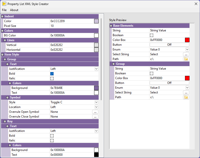
XML Style string
You can customize the appearance of the property listbox using an XML style string. This style string describes the entire look of the listbox, including any custom icons used. This makes it easy to coordinate multiple property listboxes or quickly change their appearance at runtime.
Using the “Open XML Style Creator” tool, available in the toolkit, you can create or modify an XML style string.
Easy to create
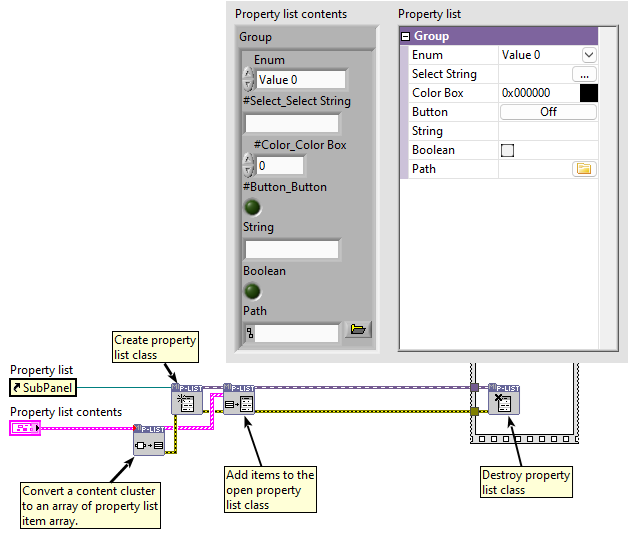
To define the contents of a property list, you can use an item cluster array that describes the contents of each item. Using the included “Variant to Items” function, it’s also possible to generate this item cluster array from a cluster. Using the “Build array” function, multiple item cluster arrays can be combined to describe the contents.